Enabling faster, more consistent design and development at scale
Discovery and research
A shared component library used across all global products
Custom theming for sub-brands without compromising design integrity
Multilingual and RTL-ready components
Full implementation into live products, with updates maintained regularly
Design process
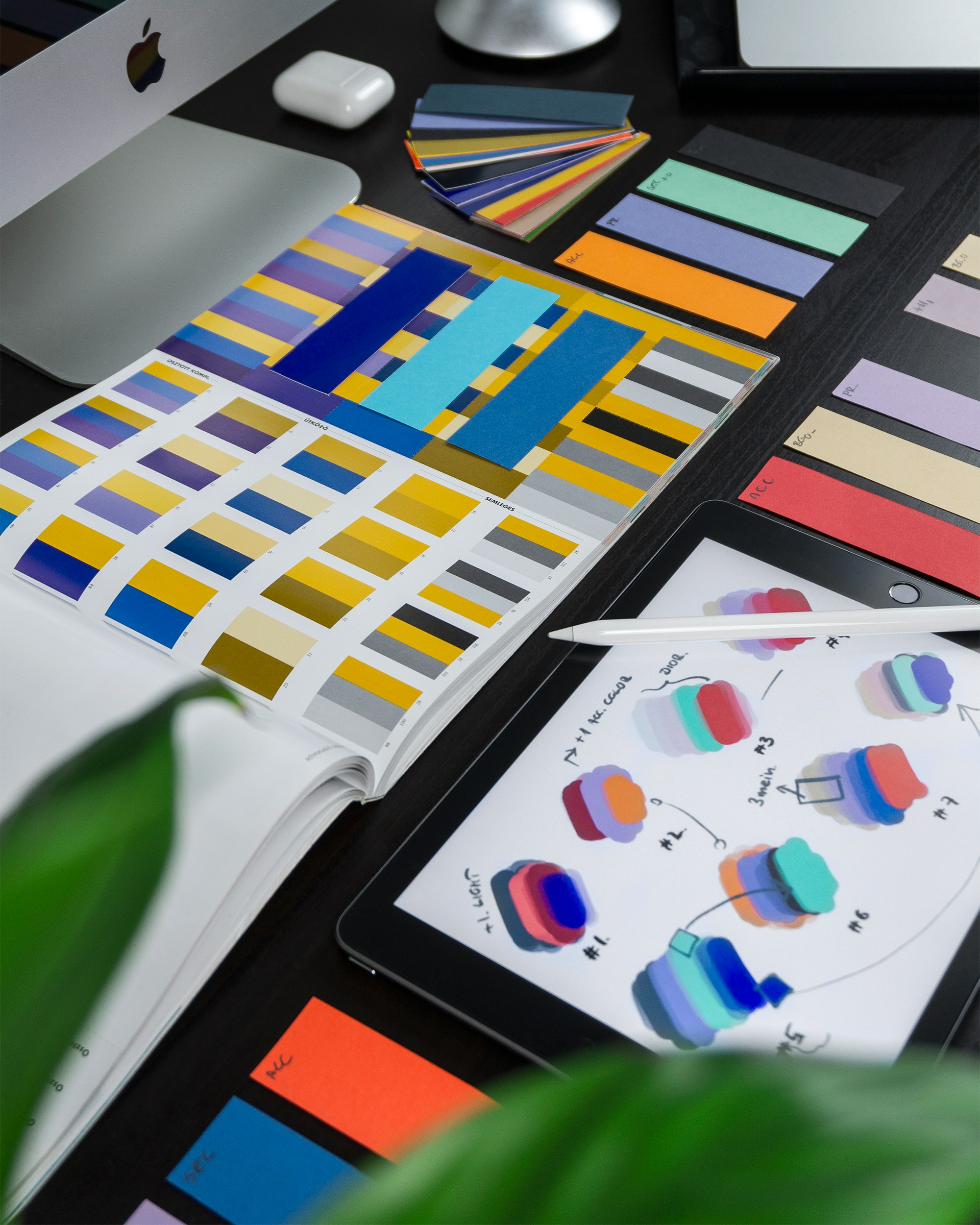
Foundation & Principles
We defined a shared design language that balanced consistency with flexibility. Core principles guided decisions on accessibility, internationalisation, and scalability.
Component Creation
Using Sketch, we created a library of foundational elements (typography, colour, spacing, grids) and scalable components (buttons, forms, navigation, cards) that supported responsive behaviour and localisation.
Sub-brand Theming
Sub-brand variations were supported via themeable tokens and adjustable styles, allowing different regions to maintain their identity while using shared components.
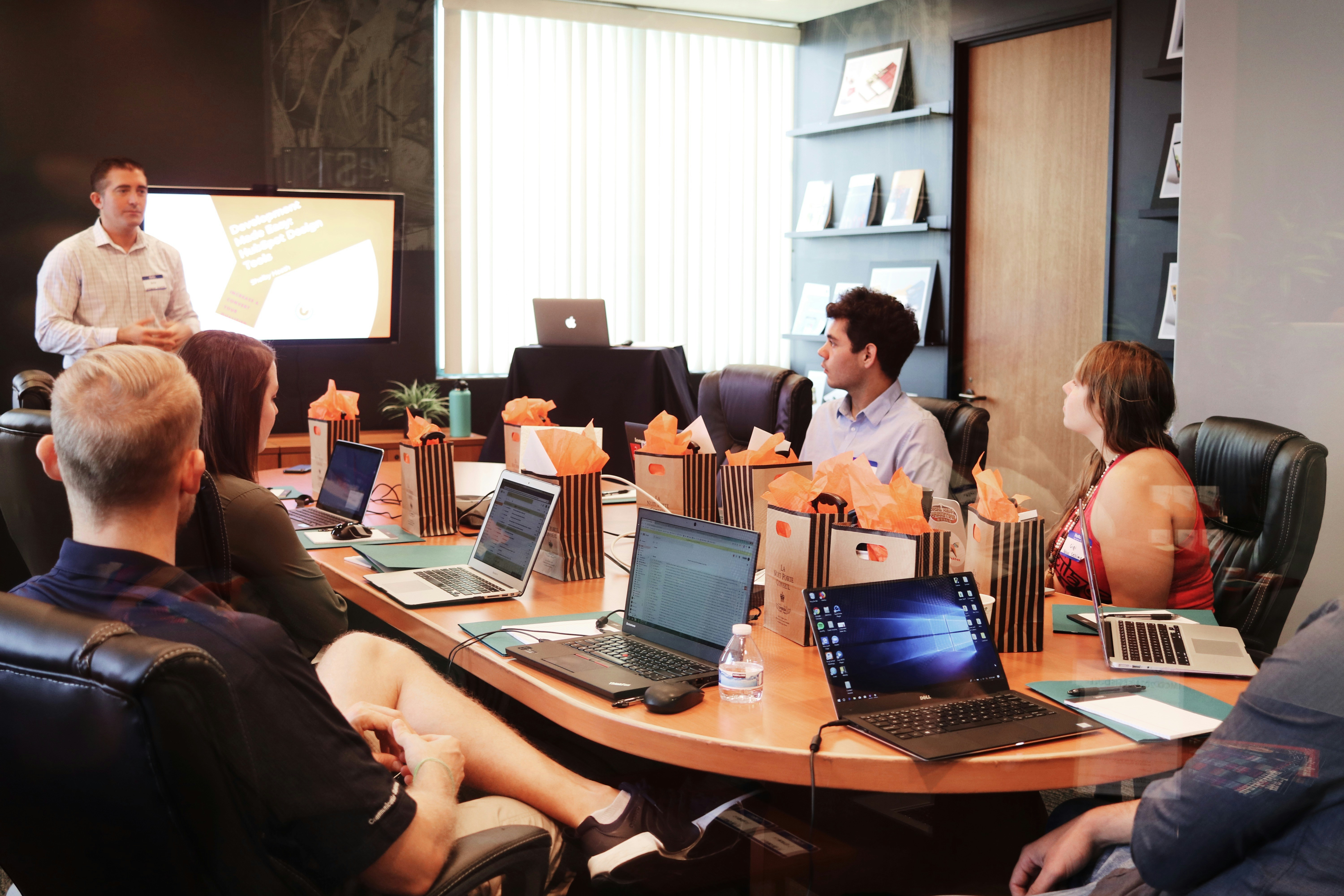
Documentation & Guidelines
I led the creation of comprehensive documentation that included usage rules, accessibility considerations, and brand guidance. This played a critical role in helping teams adopt the system confidently.